
What do you get when you mix a bizarre haunted house, a book-within-a-book, and wild page layouts? You get House of Leaves—a novel that plays with your mind and your eyes. But what happens when a book known for its visual tricks tries to become accessible to people who are blind or have low vision? That’s where the magic of Braille and print design innovation comes in.
TL;DR
House of Leaves is a strange and creative novel that messes with how a book should look and feel. Turning that into Braille is a big challenge. Designers and accessibility experts had to rethink how to make Braille as expressive as the original print. It’s a unique journey that turns a wild visual experience into a powerful touchable one.
What Makes House of Leaves So Weird?
This book isn’t just a story. It’s an experience.
Here’s what makes it special:
- Text that spirals or runs sideways
- Pages with only one or two words
- Multiple narrators and footnotes
- Words shrinking or growing to match plot action
- The word “house” always shown in blue
These choices aren’t just for show. They help tell the story and build emotion. The format messes with the reader’s sense of space—perfect for a tale about a house that expands into dark, endless hallways.
Now Imagine That… Without Sight.
For blind readers, all this creativity vanishes if it’s simply read aloud or translated flatly into Braille. So we ask a major design question: Can you preserve the weirdness… in Braille?
The answer? Yes, but it takes work.
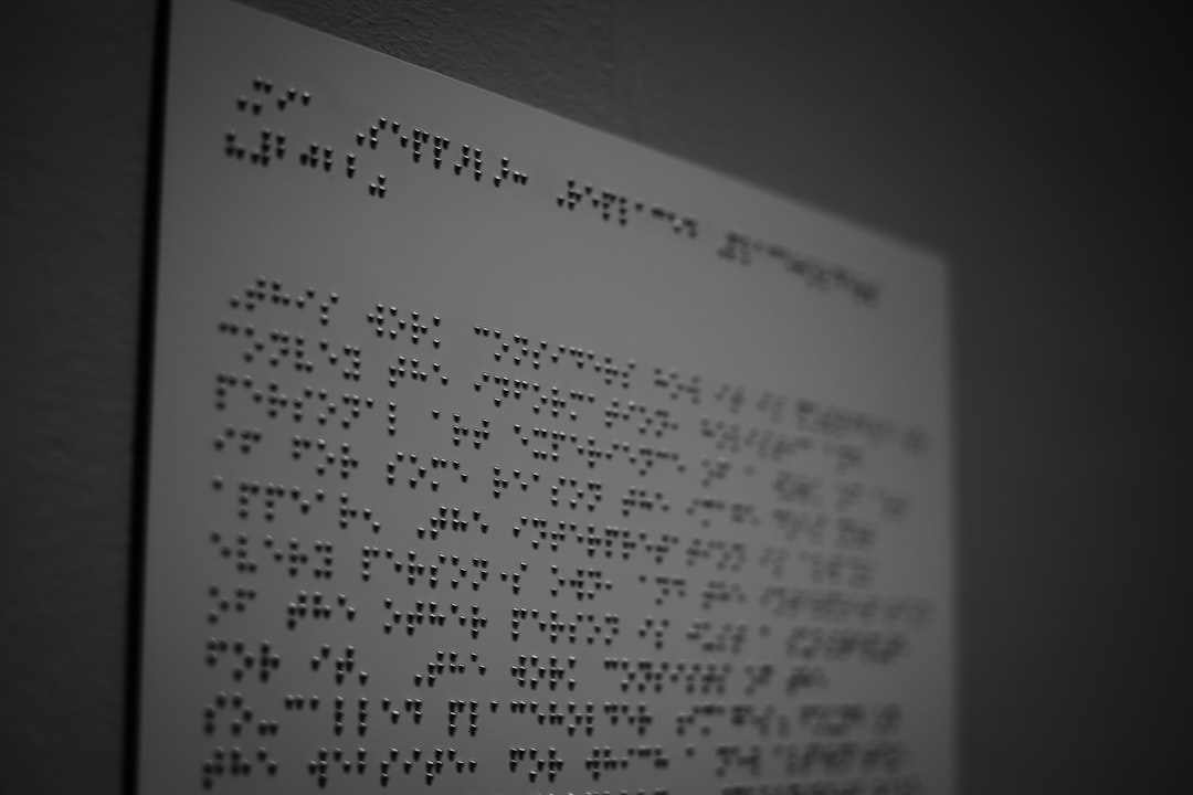
Challenges of Turning Visual Chaos into Braille
Braille is usually clean and orderly. That’s the point—it needs to be clear to the fingers. So how do you take a book with:
- Scattered words
- Poems hidden in footnotes
- Text printed in mirror-image
…and recreate those effects by touch?
Let’s break down some of the key problems and the cool solutions designers found.
1. Keeping the Layout Artwork
In some parts of the book, the layout is the story. Designers had to come up with new ideas, like:
- Using Braille to “spiral” around the page
- Adding blank Braille cells to create empty space
- Building texture into the paper using embossing
This way, readers can feel when the book is getting weird, just like sighted readers can see it. It’s communication through spacing and structure—not just words.
2. Color as Meaning
Remember how the word “house” is always blue in the original? That emotion is lost in regular Braille. So, designers used:
- Tactile marks before the word
- Raised outlines around the word
- A Braille legend to explain symbols
This way, the special feeling that comes whenever “house” appears isn’t completely lost.
3. Narrator Swaps and Layered Storytelling
There are multiple narrators in House of Leaves, and each has a different style. In print, this shows up with:
- Font style changes
- Notes in boxes
- Text written sideways
In Braille, this needed a new solution. Designers used:
- Different Braille types or code styles
- Special separator lines
- Symbols that show who is speaking
Readers can follow the story threads using touch alone.
How Is This All Printed?
Braille is normally printed using machines that punch dots onto thick paper. For House of Leaves, more was needed.
Innovators used:
- Multi-level embossing: to create textures, not just words
- Heat-sensitive paper: that changes shape to allow layering
- Custom page cuts: to show shapes or holes that matter in the story
This isn’t just a book—it’s more like a 3D sculpture that tells you a story line by line.
Why Go Through All This Trouble?
Because stories matter to everyone. That’s especially true with a book like this, where how the story is told matters as much as the plot.
People who use Braille also deserve to feel the story the way it was meant to be felt. Innovation in print design opens big doors for accessibility and creativity.
The Future of Books? Tactile Design for All.
What started with House of Leaves could lead to new types of books for everyone:
- Interactive novels combining print, touch, and sound
- Books that teach design through texture
- Story experiences made for mixed-ability classrooms
These aren’t just for blind readers—they make reading playful and physical for everyone. Once you start thinking in 3D, you’re not going back.
Final Thoughts
House of Leaves in Braille is more than just translation. It’s a transformation. It turns the visual horror and mystery of the book into something readers can explore with their hands.
The journey isn’t easy. But it proves one thing: with a little creativity, even the strangest, most confusing book can become touchable, readable, and just as haunting.
And maybe, just maybe, that endless hallway you can’t quite see will send a chill down your spine, even through your fingertips.